Bangladesh has experienced significant growth in the technology sector in recent years, and web design is no exception. As the industry continues to evolve, web designers in Dhaka need to stay up-to-date with the latest trends and technologies to remain competitive.
Mobile-First Design: Adapting to the Increasing Mobile User Base in Bangladesh
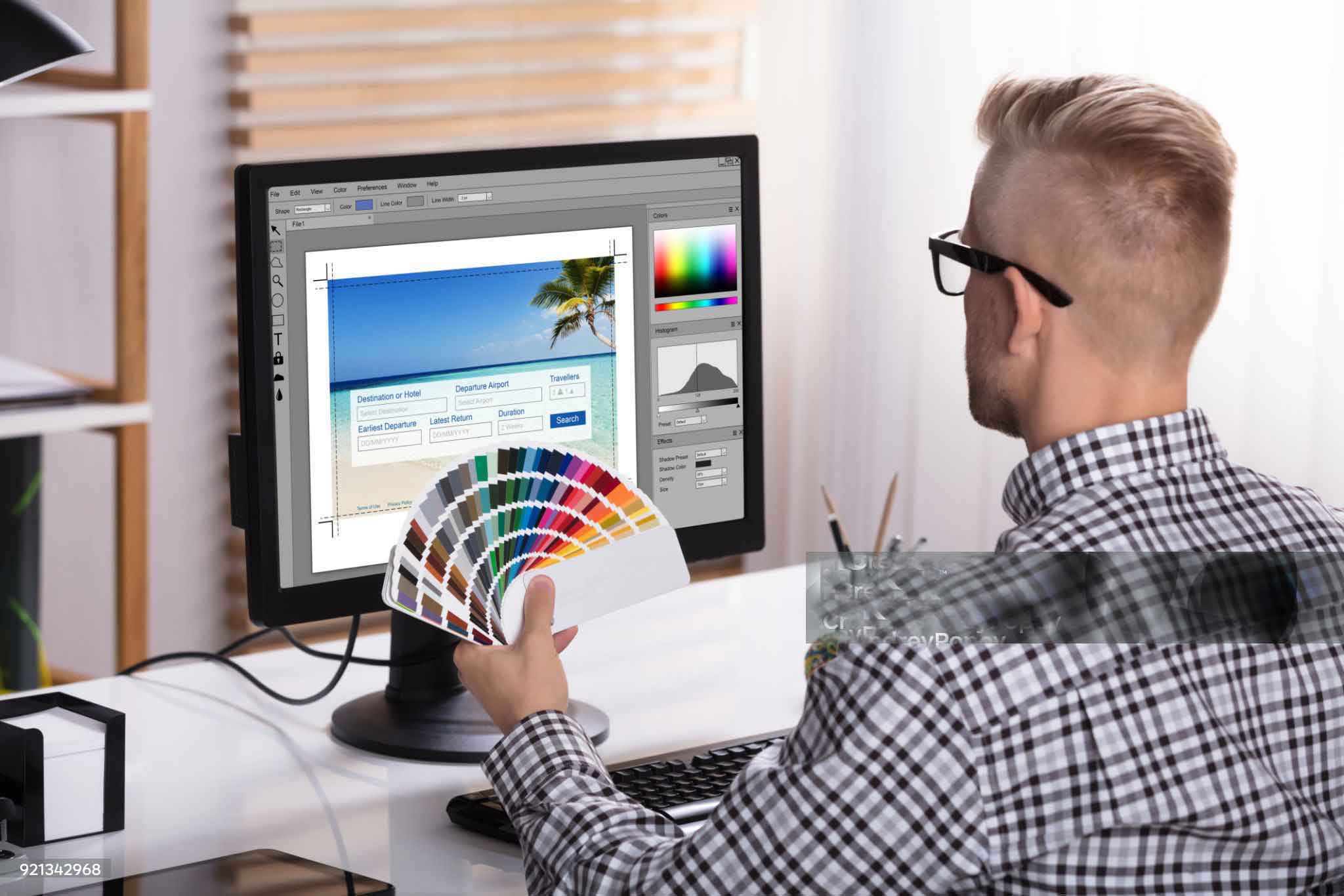
Mobile-First Design has become an essential aspect of web development in today’s digital landscape, especially in countries like Bangladesh where the use of mobile devices is rapidly increasing. With the majority of the population accessing the internet through mobile devices, it is imperative for businesses and developers to adapt to this trend and design websites and applications with a Mobile-First approach.
In Mobile-First Design, the primary focus is on creating a seamless user experience on mobile devices, followed by optimizing the design for desktop and tablet devices. This approach allows developers to prioritize the essential features and content that are crucial for mobile users, creating a smooth and efficient user experience.
Implementing Mobile-First Design requires a thorough understanding of the mobile user base in Bangladesh. This includes factors such as screen size, internet speed, and device capabilities. To accommodate the varying mobile specifications, developers can employ responsive design techniques to ensure that the website or application is accessible and user-friendly across a wide range of devices.
By adopting a Mobile-First approach, businesses and developers in Bangladesh can cater to the growing mobile user base, providing a convenient and optimized experience for their customers. Additionally, mobile optimization can enhance the website’s SEO ranking, as search engines prioritize mobile-friendly websites.
In conclusion, Mobile-First Design has become a necessity for businesses and developers in Bangladesh to keep up with the increasing mobile user base. By prioritizing mobile design and optimizing for varying device specifications, developers can create a user-friendly and accessible experience that meets the needs of today’s digital landscape.
Micro-Interactions: Enhancing User Experience with Subtle Animations and Interactions.
Micro-interactions refer to subtle animations and interactions that occur within a user interface to enhance the overall user experience. These interactions can be as small as a button changing color when clicked or a notification popping up when a task is completed. Despite their small size, micro-interactions can have a significant impact on the user experience by providing feedback, engaging the user, and adding an element of delight.
In recent years, micro-interactions have become increasingly popular in web and mobile design as they help to create a more engaging and intuitive user experience. By providing visual and audio feedback, micro-interactions help users understand the impact of their actions, making the interface more intuitive and easier to use. Additionally, micro-interactions can be used to communicate important information or provide context to the user.
Micro-interactions can also add an element of delight to the user experience, making it more enjoyable and memorable. For example, a loading spinner animation can be made more entertaining by adding a playful animation or a witty message, keeping the user engaged and entertained while they wait for the task to complete.
Implementing micro-interactions requires a thorough understanding of the user’s needs and behaviors. Developers must carefully consider the timing, duration, and style of the interaction to ensure that it enhances rather than detracts from the user experience. Additionally, micro-interactions must be optimized for performance to ensure that they do not negatively impact the loading time of the interface.
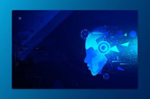
Artificial Intelligence in Web Design: Automating Personalized User Experiences
Artificial Intelligence (AI) is a powerful tool that can be leveraged in web design to automate and personalize user experiences. By analyzing user behavior and data, AI algorithms can create customized experiences for each user, enhancing engagement and driving conversions.
AI can be used to automate many aspects of web design, such as layout, color schemes, and typography. With AI-powered tools, developers can quickly generate website layouts and styles that are optimized for user engagement, reducing the time and effort required for manual design.
In addition to automating design elements, AI can be used to personalize the user experience. By analyzing user behavior, AI algorithms can make data-driven decisions about what content to display, which products to recommend, and how to structure the interface to meet the user’s needs.
Personalized experiences can significantly enhance user engagement and drive conversions. By tailoring the user experience to each individual user, businesses can create a more meaningful and memorable experience, increasing customer loyalty and brand advocacy.
Implementing AI in web design requires a careful consideration of the user’s needs and behaviors. AI algorithms must be trained on relevant data and tuned to deliver personalized experiences that align with the user’s goals and preferences. Additionally, developers must ensure that AI-powered interfaces remain accessible and easy to use, providing value to all users regardless of their technical expertise.
Adaptive and Responsive Design: Meeting the Changing User Behavior with AI and Machine Learning
Adaptive design refers to a design approach that adapts to the user’s device and context, using information such as the device type, screen size, orientation, and location. This approach relies on a set of pre-designed templates and rules that define how the content and layout of a website or app should change in response to different devices and contexts. For example, an adaptive website might use a different layout for desktop users than for mobile users, or it might display different content based on the user’s location or time of day.
Responsive design, on the other hand, is a design approach that responds to the user’s device and context in real-time, using flexible layouts and elements that can adjust and reorganize themselves based on the user’s device and screen size. This approach relies on fluid grids, flexible images, and other techniques that allow the website or app to dynamically adjust to the user’s device and context, without the need for pre-designed templates or rules. For example, a responsive website might adjust the size and position of its images and text based on the user’s screen size, or it might change the layout of its navigation menus and buttons based on the user’s device.
Both adaptive and responsive design can be enhanced by AI and machine learning algorithms that can analyze user data and behavior to optimize the user experience. For example, AI algorithms can analyze user engagement and conversion rates across different devices and contexts, and use this information to dynamically adjust the layout and content of a website or app to maximize user engagement and conversion. Machine learning algorithms can also analyze user behavior patterns and preferences to provide personalized recommendations and experiences that are tailored to the individual user.
The Power of Bold and Vibrant Colors in Web Design: Standing Out in a Crowded Market
In the crowded market of web design, standing out can be a challenge. One powerful way to capture attention and make a lasting impression is through the use of bold and vibrant colors. Bold colors can evoke strong emotions and convey a sense of energy and excitement, while vibrant colors can grab attention and create a sense of dynamism and movement. When used effectively, bold and vibrant colors can help a website or app to differentiate itself from competitors, create a memorable brand identity, and engage users in a unique and compelling way. However, it’s important to use these colors strategically and in a way that complements the overall design aesthetic and messaging, to avoid overwhelming or confusing the user. Ultimately, the power of bold and vibrant colors lies in their ability to communicate a message or emotion in a way that is immediate and impactful, capturing attention and drawing users in to explore and engage with the content.
Accessibility in Web Design: Ensuring Websites Are Accessible to All Users
Accessibility in web design is crucial to ensuring that websites are available and usable by all users, regardless of their abilities or disabilities. This includes individuals with visual impairments, hearing impairments, cognitive disabilities, and motor disabilities, among others. Creating accessible websites means designing and developing content that is perceivable, operable, understandable, and robust, as outlined in the Web Content Accessibility Guidelines (WCAG) developed by the World Wide Web Consortium (W3C).
There are several ways to achieve accessibility in web design. One important strategy is to use clear and consistent labeling for content and navigation, and to provide alternative text for images and other non-text content to assist users with screen readers. Another strategy is to use high contrast colors and text sizes that are adjustable, to improve readability for users with visual impairments. In addition, designing websites with a logical and intuitive layout can help users with cognitive disabilities to navigate content more easily.
To ensure that websites are accessible to all users, web designers and developers should be familiar with the WCAG guidelines and incorporate them into the design process. This may involve testing websites with assistive technologies such as screen readers and voice recognition software, and making adjustments to the design based on user feedback. By creating accessible websites, designers and developers can help to ensure that all users can access and benefit from the information and services provided on the web. This not only benefits individuals with disabilities, but also creates a more inclusive and equitable online environment for everyone.
Minimalism in Web Design: A Trend Towards Simplicity and Functionality
Minimalism in web design is a trend towards simplicity and functionality that focuses on using only the essential elements to create an effective and engaging user experience. This approach involves reducing clutter and eliminating unnecessary features or design elements, in order to create a clean and streamlined aesthetic that emphasizes usability and functionality.
Minimalist web design typically relies on a limited color palette, simple typography, and clean, uncluttered layouts. It often incorporates negative space or white space to create a sense of balance and visual harmony, while highlighting key elements and content. This minimalist approach can help to improve website loading times, reduce distractions, and increase user engagement by emphasizing the most important information or actions.
One of the key benefits of minimalist web design is that it can make websites more accessible to users with a wide range of abilities and preferences. By reducing visual clutter and focusing on functionality, minimalist design can improve readability and navigation, making it easier for users to find the information they need and complete the actions they want. It can also create a more visually appealing experience for users, by emphasizing the beauty and simplicity of well-designed interfaces.
However, it’s important to note that minimalist design is not always appropriate for all websites or audiences. In some cases, more elaborate designs or visual elements may be necessary to convey the brand identity or appeal to a specific target audience. Therefore, it’s important for designers to consider the goals and objectives of the website, as well as the needs and preferences of the target users, when deciding whether to adopt a minimalist approach.
The Role of Video in Web Design: Enhancing Engagement and User Experience
Video has become an increasingly important element in web design, as it can enhance engagement and improve the overall user experience. Video can be used to showcase products, services, or events, as well as to tell stories or convey complex ideas in a dynamic and visually compelling way.
One of the key benefits of video in web design is that it can capture attention and engage users in a way that other forms of content may not be able to. Video can create an emotional connection with users, allowing them to see and hear the message being conveyed in a more impactful way. Additionally, video can help to improve website SEO by increasing dwell time and reducing bounce rates.
Designing for Voice Search: Preparing for the Increasing Use of Voice Assistants
With the increasing use of voice assistants such as Siri, Alexa, and Google Assistant, designing for voice search has become an important consideration in web design. Voice search allows users to perform searches and interact with websites using natural language, without the need for a traditional keyboard or mouse. This can be particularly useful for users who have mobility or visual impairments, or who simply prefer the convenience of voice-based interactions.
To design for voice search, web designers must consider several factors. First, they need to ensure that their websites are optimized for voice search queries by incorporating natural language keywords and phrases that align with how users might speak when performing a search. This may involve using long-tail keywords and incorporating conversational language that is more reflective of how people talk than how they write.
Another important consideration is to ensure that websites are structured in a way that is easy for voice assistants to understand and navigate. This may involve using structured data markup to provide additional context and information about website content, as well as ensuring that website content is well-organized and easy to navigate.
The Impact of Augmented Reality in Web Design: Creating Immersive User Experiences
Have you ever tried on clothes or makeup virtually before making a purchase? That’s just one example of how augmented reality (AR) is transforming web design and creating immersive user experiences.
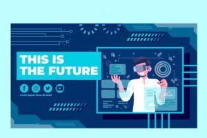
AR allows designers to overlay digital content onto the physical world, creating a blended environment that users can experience through devices such as smartphones or head-mounted displays. This technology enables websites to create engaging and interactive experiences that allow users to interact with products or services in a more meaningful way.
For instance, AR can be used to create virtual try-on experiences for clothes, shoes, or makeup, allowing users to see how they would look before buying. It can also be used to create interactive product demos or tours, giving users a dynamic and engaging way to explore and learn about products or services.
The beauty of AR in web design is that it can create a sense of presence and immersion, making users feel like they’re interacting with the content in a more tangible and meaningful way. This, in turn, can increase user engagement and satisfaction, providing a unique and memorable user experience that sets the website apart from others.